Uncompromising in Model Risk Management
Founded in 2017, Yields is now celebrating its 7th anniversary with an exciting rebranding and a new brand identity. This rebrand marks a significant milestone in our journey, presenting a bold new identity that better reflects who we are and what we stand for.
Our new identity is driven by a clear vision to accurately describe our core values and future aspirations. It includes a modern color palette that embodies our innovative spirit and commitment to staying current with industry trends. Additionally, our memorable new logo and tagline symbolizes our expertise in managing and mitigating model risk, ensuring consistent branding and a strong global presence.
To complete our rebranding and new identity, we have also renamed our products to better convey their purpose. Chiron App is now Yields for Performance, and Chiron Enterprise has been renamed to Yields for Governance. In addition, we have redesigned our website’s user experience (UX) to be more intuitive and user-friendly, making it easier to navigate and find essential information.

Logo and name update
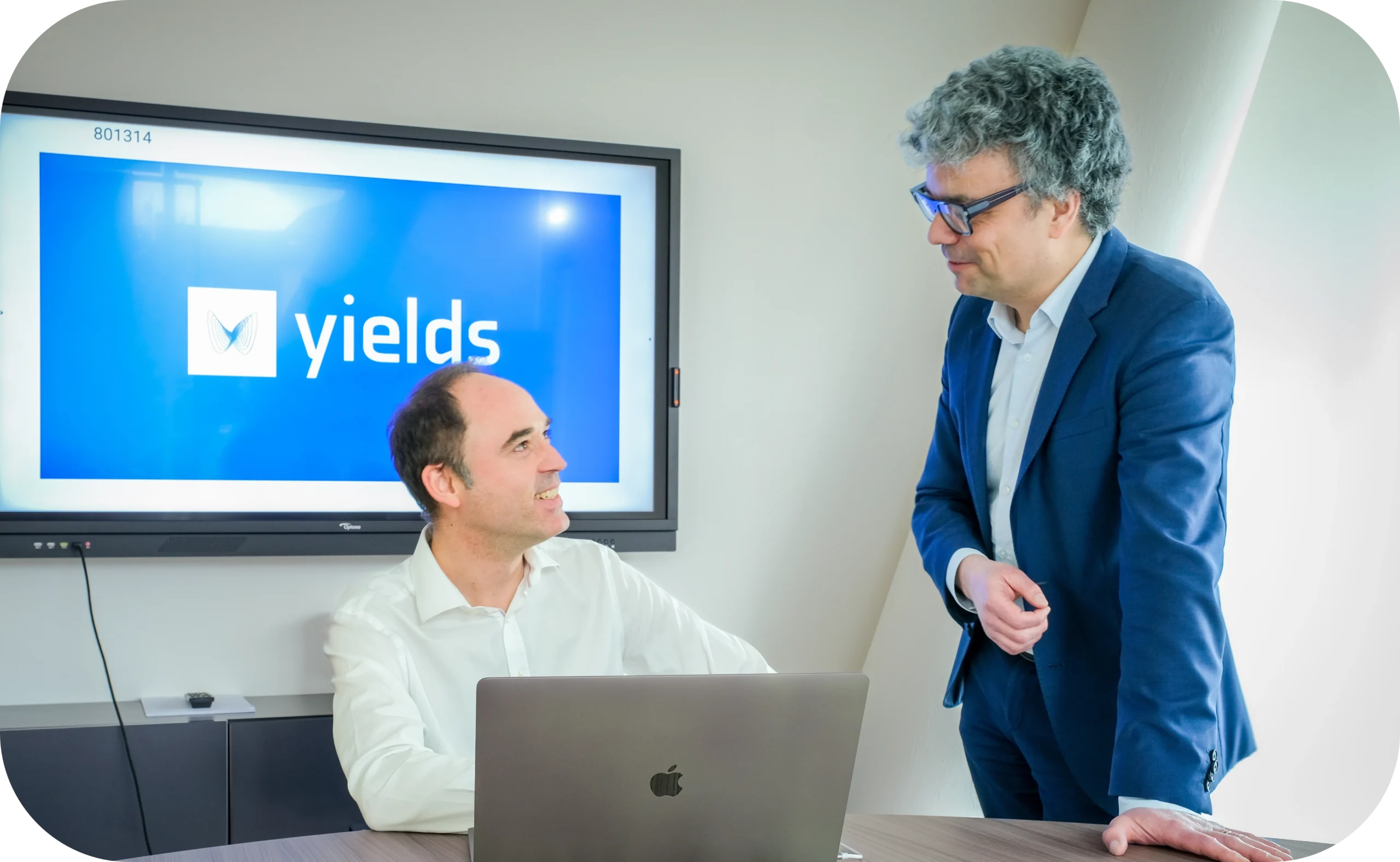
As part of our rebranding and new identity, we have transitioned from our old logo featuring the capital “Y” to a design that more accurately reflects our services and values. Our new, bold logo features a white and blue color scheme, showcasing our name alongside a butterfly encased in a box. This design symbolizes the Lorenz attractor, highlighting our commitment to control the impact of unanticipated events through sound engineering, precision and innovation in the financial sector. Additionally, we have simplified our name by dropping “.io” and will be known simply as Yields moving forward. This update not only modernizes our brand but also underscores our dedication to providing world-class solutions to our clients.
Website and colors
To complete our comprehensive rebranding initiative, we are thrilled to unveil not only a new logo but also a completely redesigned website. The updated site embraces a vibrant and bold color palette, featuring shades of electric blue, magenta, dark orange, teal, and lavender. These colors are chosen to represent our dynamic and innovative spirit while ensuring our brand stands out in the crowded financial technology market.
The website redesign goes beyond aesthetics. We have significantly improved the user experience (UX) to ensure that important features of our service are highlighted and more accessible. The streamlined navigation makes it easier to find the information our audience needs, enhancing their interaction with our platform.
We have also integrated modern illustrations uniquely crafted for us, utilizing mathematical patterns inspired by the Lorenz attractor. These elements not only enhance the visual appeal of the site but also reinforce our commitment to sophisticated, data-driven solutions. This redesign provides a more contemporary and memorable look, ensuring our brand is both distinctive and easy to remember.
Product Updates
Our award-winning model risk management technology, previously known as Chiron App and Chiron Enterprise, continues to set the industry standard for its flexibility and feature-richness. As part of our refreshed brand identity, we have renamed these modules to better reflect their specific roles and benefits. Chiron App is now called Yields for Performance, emphasizing its focus on enhancing operational performance and efficiency for both model developers and validators. Chiron Enterprise is now named Yields for Governance, highlighting its role in ensuring robust governance and compliance. Both modules together are referred to as the Yields MRM Suite. As our offering continues to expand, we will add additional services to the suite in the years to come.
While these products have undergone minor visual updates, including the integration of our new logo, their core functionalities remain unchanged. This rebranding effort was driven by a desire to provide clearer, more descriptive names that accurately convey the purpose and strengths of each module without altering the powerful features our clients depend on. The enhancements are purely aesthetic, aimed at aligning with our new brand identity while maintaining the high standards of service and capability that have earned us industry recognition.
Our future vision
As a final, yet crucial part of our rebranding, we have thoughtfully updated our company values, vision, and mission. Over the past seven years, as Yields has grown, we’ve welcomed new people, expanded to new locations, and embraced diverse cultures within our team. Recognizing these changes, it was time to reassess and update our company values.
To ensure these new values truly resonate, we conducted an extensive process of gathering input from everyone within the organization. We sought insights on what matters most to our employees and aligned these priorities with both our current identity and our future aspirations. This collaborative approach not only helps us stay true to who we are now but also defines who we aim to become as a company.
By integrating diverse perspectives, we ensure our values reflect the collective ethos and drive of our entire organization. This process has allowed us to articulate a clear and ambitious path forward, guiding us toward our long-term goals with a shared sense of purpose and direction. Our new values and mission statement focus on assurance and trust, on diversity of opinions and on the scientific ethos; all these aspects play a crucial role in addressing emerging AI risks. Our values encapsulate our commitment to innovation, integrity, and excellence, setting the stage for our continued growth and success in the years to come.


